How Custom Office Signage Creates a Clearer Workplace
A well-organised office should help employees work comfortably and allow visitors to find their way without confusion. Clear signs identify departments, meeting rooms, reception areas, and individual workspaces, making everyday movement easier. Through carefully planned custom office signage, businesses can create an environment that communicates information clearly while maintaining a consistent interior appearance. The right signs do not need complicated designs; they need to be readable, correctly positioned, and suitable for the spaces where people use them.
Office signage also contributes to the first impression a workplace creates. When visitors enter a building, they often notice the reception display, company name, room labels, and directional information before meeting anyone. These details help them understand the organisation of the business and make the environment feel more professional.
1. Understanding the Purpose of Custom Office Signage
Office signs serve several practical functions. They identify people and departments, guide visitors, communicate important instructions, and help employees understand the layout of a building.
A small office may only need a reception sign, a few door plates, and meeting-room labels. A larger company with several floors may require a complete identification and navigation system.
Common applications include:
- Reception and company name displays.
- Employee names and job titles outside offices.
- Meeting-room and conference-room signs.
- Department identification boards.
- Floor directories and directional displays.
- Restroom and facility signs.
- Safety notices and restricted-area signs.
- Glass partition graphics and privacy markings.
For example, a visitor arriving at a company for the first time should be able to identify the reception desk without asking several employees for help. Once checked in, clear directional signs can guide the visitor towards the correct meeting room.
The purpose of each sign should be established before choosing its size, material, or design. This prevents unnecessary information from being added to places where a simple label would be more effective.
2. Choosing the Right Materials for Office Signs
Material selection affects the appearance, durability, maintenance, and cost of a sign. The best option depends on the office interior, installation surface, and expected use.
Acrylic Signs
Acrylic is a popular material for modern office interiors. It has a smooth surface, comes in different colours and thicknesses, and can be cut into letters, logos, and custom shapes.
Clear acrylic can create a minimal appearance, while frosted finishes are useful for glass partitions and private meeting areas. Coloured acrylic can also provide contrast against light or dark walls.
For example, a company may install a clear acrylic reception panel with raised lettering to create a clean and simple focal point. Smaller acrylic plates can then be used outside individual offices to maintain a consistent appearance.
Metal Signs
Metal signs are often chosen for corporate environments where a solid and formal finish is preferred. Common materials include aluminium, stainless steel, and brass.
Aluminium is relatively lightweight and can be used for wall displays, room identification, and directories. Stainless steel offers a durable metallic appearance and is often used for executive offices and reception areas.
Brushed metal finishes can reduce the visibility of minor fingerprints compared with highly polished surfaces. The material grade and finish should still be selected according to the installation environment and cleaning requirements.
Wooden Signs
Wood can add warmth to an office, particularly where the interior uses natural colours, furniture, and decorative finishes. It is suitable for certain reception areas, creative studios, consultation rooms, and private offices.
Different wood tones create different visual effects. Light wood may suit a contemporary workspace, while darker finishes can complement traditional furniture. Since wood can react to moisture and temperature changes, the finish and installation location should be considered carefully.
Glass Signs
Glass displays can provide a refined appearance in executive spaces and reception areas. They are often used for company names, logos, and information panels.
However, glass requires suitable mounting hardware and careful handling. Businesses should consider safety, cleaning, reflections, and the possibility of accidental impact before selecting it for a high-traffic area.
3. Designing Signs for Different Office Areas
A workplace contains several types of spaces, and each needs information suited to its function. Using the same design everywhere may not be practical, but a consistent visual style helps connect the different signs.
Reception and Entrance Displays
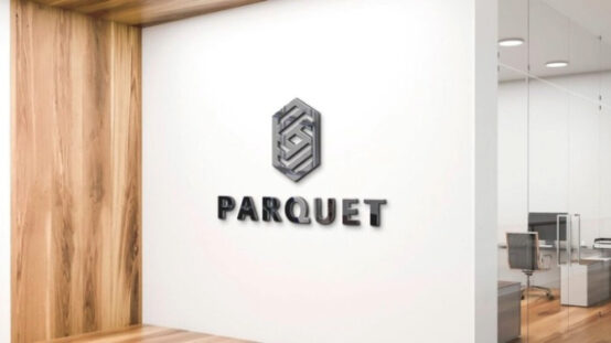
The reception area is usually the first point of contact for visitors. A company name or logo display should be visible from the entrance and positioned where it does not compete with other decorative elements.
The design should reflect the office interior without making the reception area crowded. Raised letters, acrylic panels, metal logos, and printed wall graphics are common choices.
Office Door Name Plates
Door plates identify employees, managers, and departments. They may display a person’s name, job title, or room function.
A simple layout is usually best. The employee’s name can appear in larger lettering, with the designation placed below it in a smaller size. Consistent spacing and font styles make the plates easier to read.
Meeting-Room Signs
Meeting rooms can be identified by names, numbers, or both. Companies with several conference rooms should use a clear naming system that matches their room-booking arrangements.
For example, a business might use names such as Meeting Room A, Meeting Room B, and Conference Room 01. The same labels should appear on internal directories and booking screens to avoid confusion.
Department and Facility Signs
Departments such as accounts, human resources, administration, and customer service should be clearly identified. Signs are also useful for shared facilities, including kitchens, restrooms, storage rooms, and staff areas.
A clear naming system helps new employees and visitors understand the workplace without repeatedly asking for directions.
4. Typography, Colours, and Readability
A sign is only useful when people can read and understand it. The choice of font, letter size, colour, and spacing should therefore be based on the viewing conditions.
Selecting Suitable Fonts
Simple typefaces are generally easier to read than highly decorative styles. Sans-serif fonts are common in modern offices because their clean letter shapes work well on small plates and larger wall displays.
The font should suit the workplace, but readability should remain the priority. A creative agency may use a more distinctive style than a financial office, yet both need lettering that visitors can recognise quickly.
Creating Strong Colour Contrast
Text and background colours should be different enough to make the information stand out. Dark text on a light background and light text on a dark background are common combinations.
Businesses should avoid using similar shades for the lettering and panel, especially when the sign is placed in a dim corridor or under strong artificial lighting.
Choosing the Correct Letter Size
The required letter size depends on how far away people will stand when reading the sign. A door plate can use smaller lettering than a floor directory or a sign above a reception desk.
It is useful to review a design at its actual size before production. This can reveal spacing and readability problems that may not be obvious on a computer screen.
5. Improving Navigation with Directional Office Signs
Large workplaces can become confusing when visitors cannot easily identify rooms, departments, and facilities. A planned directional system helps people move through the building in a logical way.
This is particularly important in office towers, medical centres, educational institutions, and commercial buildings where several organisations or departments share the same premises.
Types of Directional Signs
A complete navigation system may include:
- Directional signs: Arrows guiding visitors towards lifts, reception areas, and departments.
- Identification signs: Labels confirming the name or number of a room.
- Directory boards: Lists showing departments and their locations.
- Facility signs: Symbols and labels identifying toilets, kitchens, and shared spaces.
- Safety signs: Information about emergency exits, restricted areas, and important precautions.
A Practical Office Example
Consider a company operating across three floors. The reception area is on the ground floor, while the accounts and sales departments are on the second and third floors.
A directory near the entrance can explain the floor arrangement. Directional signs near the lifts can identify the relevant departments, and smaller labels outside each room can confirm the destination. This creates a straightforward route for visitors and reduces interruptions for employees.
6. Printing and Fabrication Methods
The production method affects the appearance and durability of office signs. Different techniques are suitable for different materials and designs.
UV Printing
UV printing applies ink to compatible surfaces and cures it using ultraviolet light. It can reproduce detailed graphics, logos, and coloured lettering.
This method is useful for signs that contain multiple colours or fine design elements. The final durability depends on the material, surface preparation, and printing system.
Laser Engraving
Laser engraving marks or removes part of a surface to create text and graphics. It is commonly used on suitable metal, acrylic, and wooden products.
Engraving can provide a neat result for door plates, desk signs, and office directories. The appearance varies depending on the material and production settings.
Vinyl Lettering
Cut vinyl is suitable for simple lettering, logos, and decorative graphics on compatible surfaces. It is often used on glass partitions, doors, and smooth wall panels.
The surface must be clean and suitable for the adhesive. Dust, moisture, and incorrect application can cause the edges to lift over time.
Raised Letters and Fabricated Displays
Some office signs use individually manufactured letters fixed to a backing panel or directly to a wall. Acrylic, aluminium, and stainless steel can be used for these designs.
Businesses reviewing printing services Dubai providers should ask which production techniques are suitable for their selected materials. Samples can help compare lettering quality, colour consistency, finishing, and overall construction before a larger order is approved.
7. Planning Installation and Positioning
Even a well-designed sign can be ineffective if it is installed in the wrong place. Before production, the installation area should be measured and checked.
Important considerations include:
- The available wall or door dimensions.
- The height and angle from which people will view the sign.
- The condition and material of the installation surface.
- Nearby lights, windows, doors, and furniture.
- The fixing method and weight of the sign.
- Access for cleaning and future maintenance.
For example, a reception display may look balanced in a design preview but become difficult to see when installed behind furniture or decorative objects. Checking the actual location helps prevent this problem.
Adhesive fittings may suit some lightweight indoor plates, while larger or heavier displays may require screws, brackets, or stand-off fittings. The fixing method should always match the sign’s weight and the wall material.
8. Keeping Office Signage Consistent with Business Identity
A consistent visual system helps an office look organised. Signs do not need identical layouts, but they should share selected design features such as colours, fonts, logo treatment, and material finishes.
A business using dark blue and white throughout its interior, for example, may use those colours across reception displays, meeting-room labels, and department signs. This creates a visual connection between different areas.
When planning signage Dubai businesses use across several branches, consistency becomes even more important. A customer visiting different locations should be able to recognise the same visual style and understand the information presented.
A simple signage guide can record approved colours, fonts, logo proportions, material choices, and standard sign dimensions. This makes future replacements and new installations easier to manage.
Zahrat Al Madina Printing is one Dubai-based provider whose work includes signage and printed display products, offering an example of the types of local production services businesses may compare when planning an office project.
9. Common Mistakes to Avoid
Office signage problems often result from small planning mistakes rather than complicated design issues.
Adding too much information: Long messages make signs difficult to read. Keep each display focused on one clear purpose.
Choosing appearance over function: A decorative design may look attractive but fail to provide useful information. Readability and correct positioning should come first.
Ignoring the office environment: A material that suits a reception wall may not be suitable for a door that receives frequent contact or a location exposed to moisture.
Using inconsistent fonts and colours: Too many design styles can make the workplace look disorganised. A simple visual standard helps maintain consistency.
Approving artwork without checking details: Incorrect names, spelling mistakes, outdated job titles, and wrong room numbers can result in unnecessary replacement costs.
Forgetting future changes: Employee names and department arrangements may change. Where regular updates are expected, businesses can consider replaceable inserts or modular sign systems.
Conclusion
Well-planned office signs make workplaces easier to understand and more comfortable to use. They help visitors identify reception areas, guide employees between departments, and provide clear information about meeting rooms and shared facilities. Material selection, typography, colour contrast, positioning, and installation all influence how effectively each sign performs.
The most suitable approach is to plan signs according to the needs of each area while maintaining a consistent visual style throughout the workplace. With careful measurements, suitable production methods, and regular maintenance, office signage can remain useful, readable, and presentable as the business grows and its layout changes.